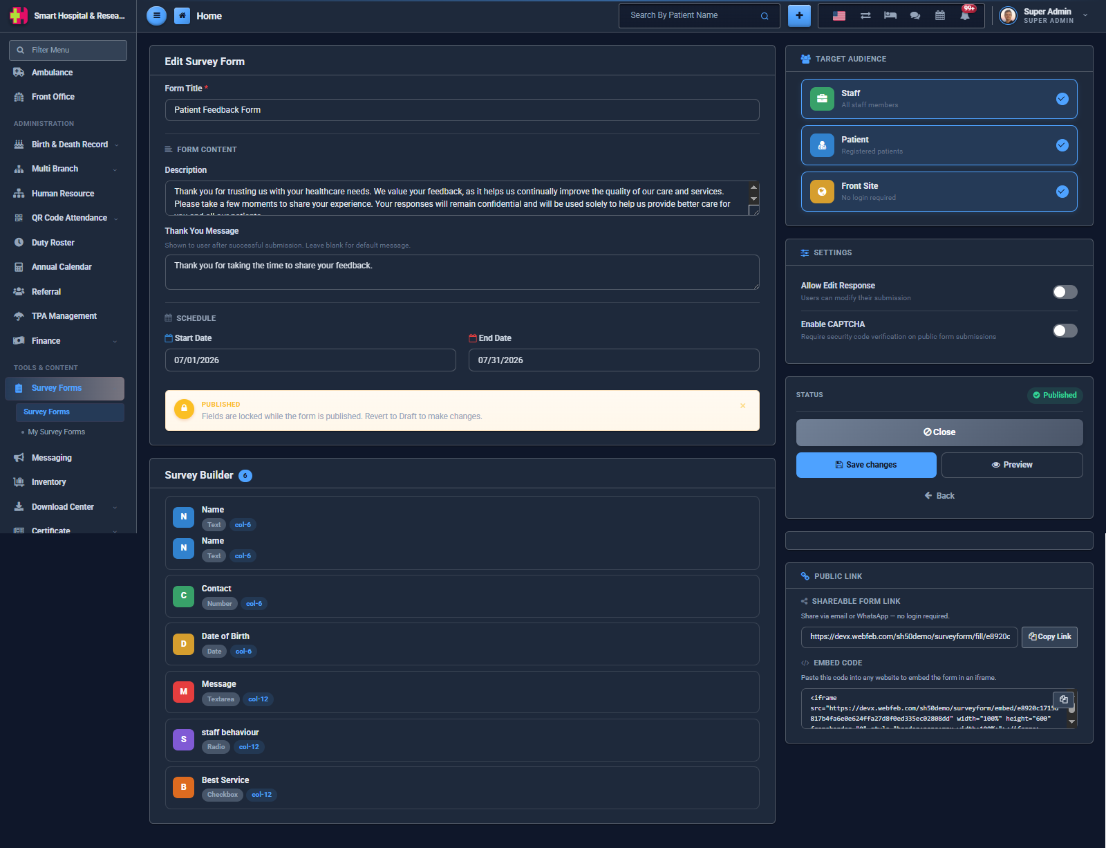
The following field types are supported:
| Field Type | Description |
|---|---|
| Text | A single line of free text. |
| Number | A numeric input. |
| Date | A date picker. |
| Textarea | A multi-line free text box. |
| Yes / No | A simple two-option choice. |
| Radio | A single choice from your own custom options. |
| Checkbox | Multiple choices from your own custom options. |
| Select | A dropdown, single choice. |
| File | Lets the user attach a file or photo with their response. |
For Radio, Checkbox and Select fields, you can add as many options as you need, and even attach a small image to each option — useful for picture-based ratings.
Drag a field up or down using its handle to change the order in which it appears on the form. Click on a field to edit its label, type or options, or to delete it.
Note: Once a form is Published, its fields are locked to protect the responses already collected against them. Revert the form to Draft status first if you need to add, edit, or remove a field.